I’ve said it before, and I’ll say it again, visual content is KING when it comes to digital marketing. We’ve wrote several articles on visual content marketing in the past, including Visual Content Marketing Fundamentals, The Evolution of Visual Content Marketing, and Optimizing your Visual Content Marketing. We speak on visual content marketing so much because it is absolutely paramount to your success online. Without visuals, your insurance agency will not see the same traction or engagement, because we’ve noticed with our own social media and digital marketing efforts that anything we include visuals on gets more than double the engagement it would have without the use of visuals. For that reason, at this point, there is almost nothing our insurance agency pushes out online without visual content, because we know it’s absolutely critical. With all this being said about visual content marketing, we are going to review some advanced practices for you to embrace on your insurance agency’s website.
Some of us may not be quite convinced about the power behind visual content marketing quite yet, so let’s ask, why visual content marketing? Well, according to NewsCred:
- Blogs and articles that contain images get 94% more views than those without.
- 40% of people will respond better to visual information than plain text online.
- 93% of people say that visuals and imagery is the #1 factor that impacts their purchase decision.
If you haven’t already had the chance to review our previous articles, I would first take a moment to do that so you’re caught up to speed. But for today, let’s review 5 common mistakes that people make when adding images to websites, so that you can avoid them and therefore maximize your reach with your visual content marketing online.
- Uploading huge images.
It’s best to have high quality images, and sometimes that means going for a large image size that has good resolution. The only problem here is that there are images that are actually too big, and that can directly affect your website load time. Here’s the thing, most visitors on your website wait about three seconds for your pages to load (and Google has even less patience) on their computer, and are patient enough to wait five seconds on mobile. If your website is taking longer to load images, there is a potential that your lead may bounce off.
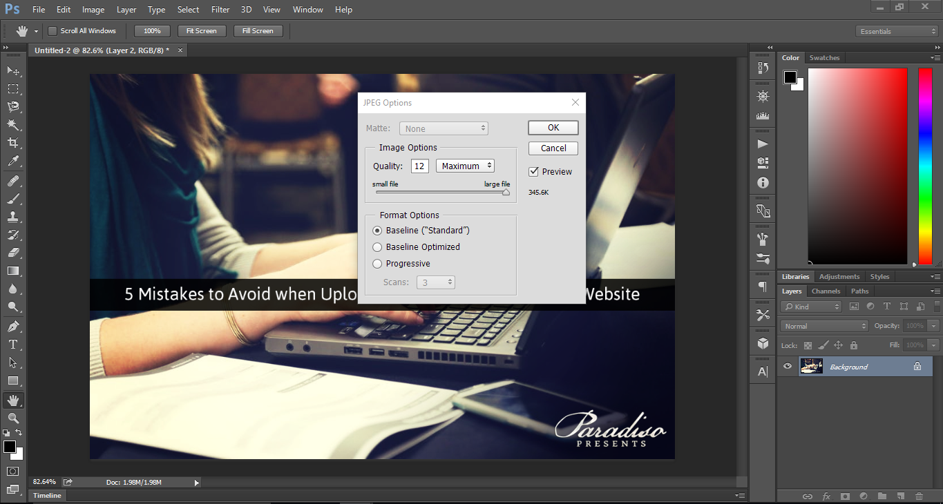
To fix this, you can simply decrease the size of the photos you are using. If you use Photoshop, you can change the quality of the image to be slightly smaller when you hit “save as” at the end of your project. For those of us who don’t use Photoshop, you can try using Compressor.io’s website to compress your images. We try to keep our file sizes below 600 KB to improve our website’s overall load speeds.

- Failing to rename images.
Yes, it is important that you rename all of your image files, because it seriously helps your website’s SEO. This will help you with competing with other insurance agencies for the top spot on Google’s search results. Google’s search results are always being updated, so it’s important to stay on top of SEO initiatives. If you fail to rename your images, then it can hurt your rankings online.
To fix this common mistake, simply take a few minutes to rename any images you create before you upload them to your website or landing pages. Using image names that are rich in keywords that properly describe the image are perfect. Although, remember that you should not keyword stuff – this is when you use way too many keywords at once and Google’s algorithms.thinks you are attempting to cheat their SEO system; be sure to be cautious of that.
- You’re missing an ALT-tag.
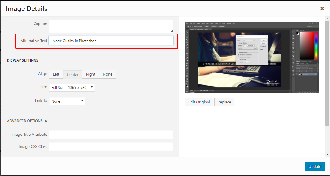
What is an ALT-tag exactly? Well, simply put, ALT tags are alternative text that you can add to an image, for times that a user’s browser can’t properly render/load the image. This ALT text tells people what the visual would have been, and also helps certain users who are visually impaired to understand your content, because they frequently refer to the ALT text instead of the actual visuals themselves. You can consider ALT text as a simple description of your visuals.
The reason ALT text is so important is because it does help the user experience in certain situations, but more importantly, it helps your SEO as well. If you include ALT text, then Google will see you as more credible and may give you a higher rank. To fix this, simply take an extra minute to add ALT text to your visuals when uploading them to your website, which can be done easily in WordPress as seen in the screenshot below.
- Your image became distorted.
This is a common problem when you have an image that needs to be slightly resized to fit on your website. In certain website editors, such as WordPress, this can be easily avoided. But with some website editors, this mistake may not be noticeable until your visuals go live on your website. Here’s an example of an original image that we’ve used on our website, and how it may appear if it was accidentally distorted when resized.
Here’s the original image:

And here’s the same image again if it were accidentally distorted:

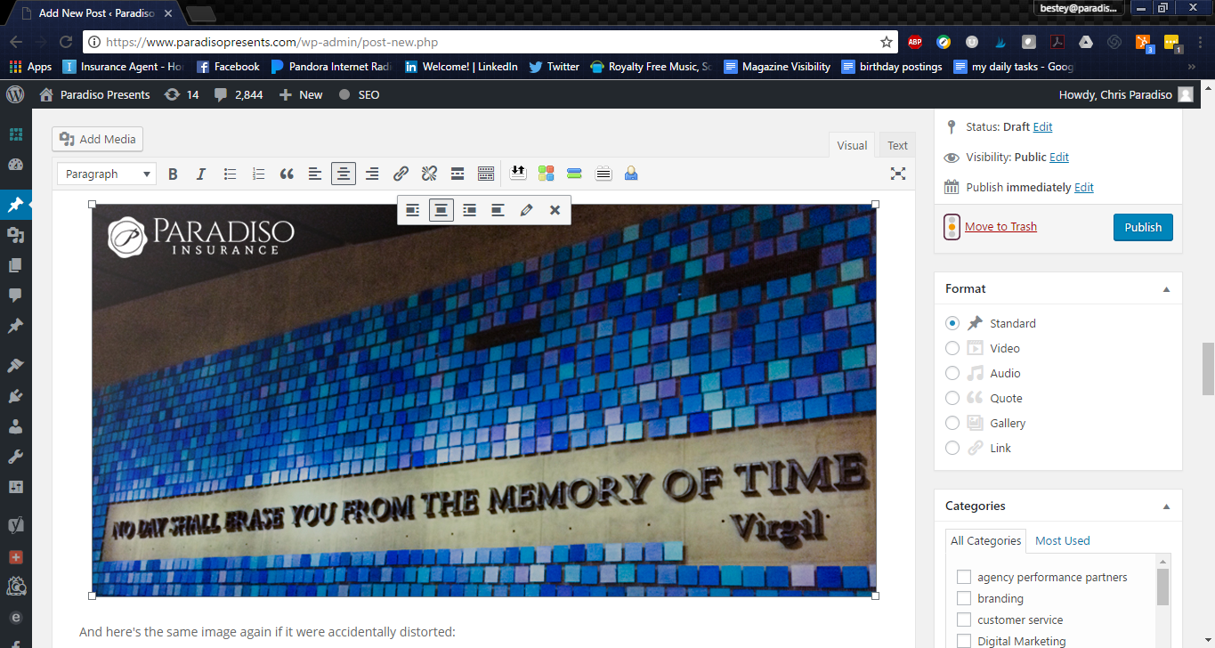
To fix this problem, simply scale the image down proportionally any time you resize a visual on your website, to ensure that it maintains the same original aspect ratio. This can be done in WordPress by using a corner box on a visual to resize it, as shown in the screenshot below. This also works the same in our marketing powerhouse tool, Hubspot.
- You overused stock photos.
While stock photos can be convenient, if they are overused, then it will become obvious to your audience very quickly. Stock photos, when overused, may be a bit uninviting for your website’s visitors, and you could risk them bouncing away from your site instead of developing a lead. We tend to use stock photos for our blog covers about 50% of the time so that they match the subject of the blog, but in this case, we try to find unique stock photos, then fill the blog with visuals crafted by our agency. Even when we use stock photos, we bring them into Photoshop to touch them up and then visually add our brand to the image. Visual branding is key to the strength of your agency’s brand.
If you feel you may be overusing stock photos on your insurance agency’s website, I would consider hiring a photographer to come down and take pictures of your office and staff, and be sure to get creative with your photoshoot. We have a photographer that comes down twice a year, and then our marketing team crafts branded agency visuals with all of the pictures we take of our events, staff, and agency. If you do need to use stock visuals, just be careful in your selecting, and try to use photos that are unique. We recommend using sites such as Pexels, Stocksnap, and Pixabay to find unique stock photos for use in your marketing.
In Conclusion
When it comes to your website, be sure to keep these tips in mind so that you can make the most out of your visual content marketing online. If you’re new to visual content marketing, I would highly suggest delegating that piece of work to a marketer in your agency, or an outsourced graphic designer that you’ve had time to sit down and discuss your agency’s overall message and brand with – be sure it’s someone you trust to take care of your visuals as well that you can work closely with. If you’re not looking to invest in Photoshop right away, a few other tools you can look at are PicMonkey, Pixlr, and GIMP. That’s it for today with visual content marketing folks. Good luck, and I look forward to seeing more optimized visuals on all of your insurance agency’s website in the near future!


