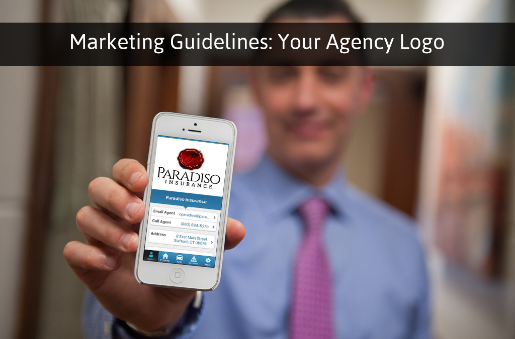
When most insurance agents think about their company’s logo, they think of it as a tool that will help their customers remember their insurance agency in a way that’s visually appealing. While this is exactly right, a lot of insurance agents don’t realize that it could be so much more than that. Your insurance agency’s logo should be welcoming, and portray a message to your audience that plays up on your brand and your core values.
Another thing you’ll want to think about is that any time you’re marketing your insurance agency, your logo will be present. Your logo will be (or at least should be) involved in any interaction you have with your audience. With that being said, your logo should be optimized from the start so that it can be as effective as possible. Let’s talk about designing a successful logo that will leave a strong impact on your customers, and prospects. I would suggest reading this whole article before you get started though, this way you don’t miss any fundamentals along the way.
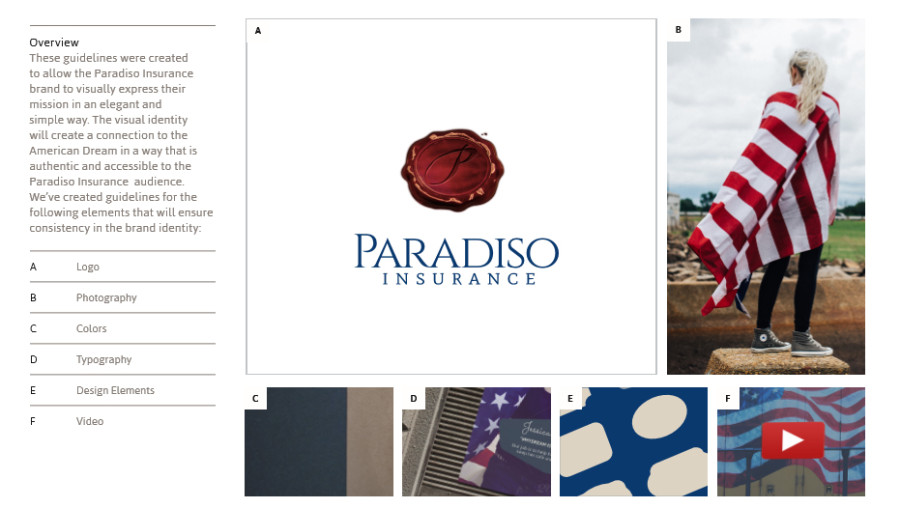
At our agency, we had a branding and graphic design professional help us come up with our logo’s guidelines to keep everything in brand.
Step 1: Design
The first step in crafting your logo is coming up with a design. Your logo’s design should be unique, and one of a kind. Remember, unique doesn’t translate to complex or complicated; it just needs to be different. Remember, your logo is a great time to reinforce your brand’s core values as well. While coming up with a design, keep your brand’s identity in mind. Even if you had a way of simply writing your company’s name or abbreviation into a visual design, you will be unique to your market space. This is a time for you to be creative, but don’t over complicate things.
Step 2: Make it Memorable
Your logo’s design needs to be memorable, so that when it comes to buying insurance, your insurance agency will jump to the forefront of a prospects mind. Generally speaking, when someone makes a purchase, they will always see the company’s name and logo, and get a small taste of the brand in the process. You need to make sure that your logo is memorable, but in a way that coincides with your insurance agency’s brand. In order to do this, make sure that your logo uses your branded colors, is easy to look at (and very visually appealing for that matter), is not too cluttered, and is easy to point out from the competition.
Step 3: Choice of Color
Speaking of branded colors, your choice of colors is also very important for crafting your logo. At our agency, we had a professional graphic designer and team of branding experts help us to craft out perfect brand identity. Within our branding guidelines, we have a specific set of colors that we use in all of our visually engaging content, including our logo. For our logo, we have several different variations of the logo itself, just to change the text of our company name from a simple branded red, to branded blue, to white, or to black. Now, we actually have about 8 colors that we consider to be “in brand” for our agency, but we decided not to over complicate things and make our logo into our branded yellow or greens, for example. The key to picking colors is to use a minimum amount of colors, because it is easier to remember. Think about McDonald’s logo… they use the “golden arches.” Keep your colors branded, but try not to go overboard.
Step 4: Remember to KISS
A great man once taught me a valuable lesson, and that was never forget to KISS… or in other words, keep it simple, stupid. As I mentioned earlier, over complicating your insurance agency’s logo may end up hurting you in the long run. The most successful company logos have been very simple in nature. Think about Nike, just being a check mark, or Subway, just being their company’s name with their branded lime green and white. There’s a few reasons this method of simple logo crafting is highly successful: first and foremost, your customers won’t have a hard time remembering what your logo looks like. The moment they see your logo, all of the connotations that make up your company’s core messages, service offerings, and brand will be what they think about first. Here’s another key point: if your logo is being printed to smaller objects such as letterheads or business cards, a complex design could look like a confusing splotch when sized down. A simple logo will retain both its quality and purpose when sized down, and you’ll be proud to show it off when handing out your business card.
Step 5: Consistency is Key
In all of marketing, whether it’s digital or traditional, consistency is a fundamental that we can never leave on the back burner. I speak on the importance of consistency all the time when talking about marketing through social media, your website, or in branding, and the same is true for your logo’s design. If your logo needs some touching up, make sure you do it all at once and then remain consistent from there on out. Google just did some logo re-design in mid-2015, and ever since, they have remained incredibly consistent to keep their audience aware of the re-design and forget about the old. This should be a one-step “out with the old, in with the new,” and there’s a very important reason behind it; once you have consistency with your company’s logo, it will become timeless, and therefore more effective. Keep it fresh, and try to appeal to every age when it comes to giving your logo a re-design, but after that, consistency is key.
These are my professional tips on getting a logo designed right. The last thing I’d like to mention is that you you should consult a professional graphic designer or branding expert when it comes to designing a logo, and if you need some suggestions, I can give you the names of a few different professionals you can interview to help you out. During the process though, it’s important to keep these tips in mind, and you can even let them serve as your fundamentals as you discuss your new logo with your graphic design professional.
Other than that, as always agents, happy marketing!


